Two colors sounds like the easier version of picking one. But if you’ve ever held a sage chip next to a white chip in your actual kitchen and still walked away unsure, you already know it isn’t.
The pairing that looked incredible online might fall flat under your lighting, against your countertops, next to your floors. Most inspiration content skips the part that actually matters: why certain combinations work and others don’t
Here’s a practical look at two-tone kitchen cabinet colors, what makes a pairing hold up, and six combinations worth considering.
Before You Pick Colors: The One Principle That Changes Everything
Contrast is not optional. Two-tone kitchen cabinets need at least three shades of separation between the upper and lower colors to read as intentional rather than accidental. Without it, two colors look like one color that didn’t quite match. Lighter shades on the upper cabinets keep the ceiling feeling open and the room feeling larger. Deeper, more saturated colors on the lowers anchor the space. The goal, as Home Decorator’s cabinet design guide describes it, is balance.
If you’re still narrowing down individual colors before thinking about combinations, our top five Utah cabinet colors post covers what works specifically in our market.
6 Two-Tone Kitchen Cabinet Color Combinations That Work

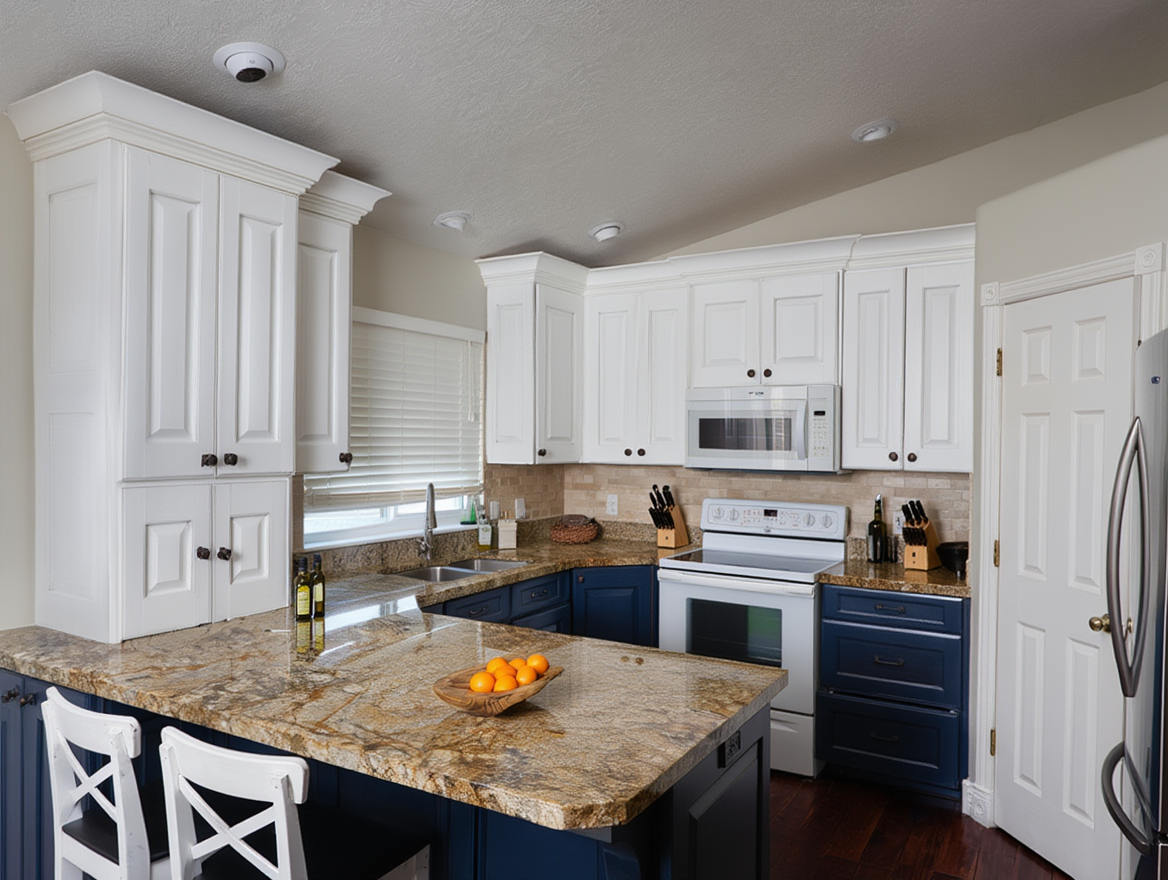
1. White Uppers and Hale Navy Lowers
The most requested two-tone kitchen cabinet colors combination, and it earns the reputation. Benjamin Moore’s Hale Navy (HC-154) is a dark, grounded navy that reads rich without going black. Against clean white uppers like Simply White (OC-117) or Chantilly Lace (OC-65), the contrast is sharp and confident. In Utah kitchens with strong natural light, this pairing holds well across morning and afternoon. Matte black hardware is the natural fit; brushed brass pulls the warmth up a level.
2. Warm White Uppers and Sage Green Lowers
Sage has been in the conversation long enough now that the risk of it looking dated in five years is fairly low. Sherwin-Williams Pewter Green (SW 6208) on the lowers with Alabaster or Dover White on the uppers is the combination showing up most consistently in Utah kitchens right now. North-facing kitchens tend to handle Evergreen Fog (SW 9130) better than Pewter Green, which can shift toward olive under cooler artificial light.
3. Light Gray Uppers and Charcoal Lowers
The understated version of two-tone kitchen cabinet colors. Same color family, well-separated shades.
Benjamin Moore’s Revere Pewter on the uppers with Kendall Charcoal on the lowers creates a kitchen that looks layered close up and clean from a distance. This is the pairing for homeowners who want depth without committing to a statement color. Low risk, high return.
4. Crisp White Uppers and Natural Wood Lowers
This combination has been replacing all-white as the default safe choice, and it works.

Painted uppers in Chantilly Lace or White Dove with stained wood lowers in a warm oak or walnut tone. The smooth paint against natural wood grain adds texture and warmth in a way a single color simply cannot. Home Depot’s two-tone design guide covers this across several kitchen styles and lighting contexts if you want to see how it lands in different settings.
5. Off-White Uppers and Deep Forest Green Lowers
More grounded than sage, more approachable than black. Benjamin Moore’s Newburg Green (HC-158) is a rich, almost-black green that changes character depending on your kitchen’s light. Paired with a warm off-white like Navajo White or White Dove on the uppers, the contrast is sophisticated without feeling heavy. Brass hardware pulls the warmth forward. Matte black keeps it more modern.
6. One Perimeter Color with a Contrasting Island
This is the entry point for homeowners who like the look but aren’t ready to commit throughout the whole kitchen. Keep all perimeter cabinets one consistent color, uppers and lowers both. Let the island carry the contrast. White or cream perimeter with a navy, sage, or charcoal island covers most of the territory without overcomplicating the decision. See how this looks across real Utah kitchens in our gallery.

A Note on Hardware
Hardware ties a two-tone kitchen together or pulls it apart, and it’s worth choosing alongside your colors rather than after. Cooler combinations like gray-charcoal or white-navy pair well with matte black or brushed nickel. Warmer combinations with sage, cream, or wood tend to look better with brass or bronze. We put together a full breakdown of Utah’s top hardware trends for 2026 covering which finishes hold up, which ones date quickly, and what to know before you order.

Two-tone kitchen cabinet colors work best when the contrast is deliberate and the two shades share something in common, whether that’s undertone, warmth level, or the elements already in the room. Pick your combination with countertops, flooring, and natural light in mind, and most of these pairings will hold up well past the trend cycle.
If you’re in Salt Lake, Davis, Utah, or Weber County and are ready to go from inspiration to an actual quote, Allen Brothers Cabinet Painting handles the color conversation as part of the bid process. No commitment required to find out what your kitchen could look like. Get your bid here.
Two-Tone Kitchen Cabinet Colors FAQ
Is two-tone still in style in 2026?
Yes, and it’s past the trend phase. The combinations holding up best are rooted in contrast and complementary undertones, not bold color choices for their own sake. The look has been around long enough that it reads as a design decision rather than a moment.
Should upper or lower cabinets be darker in a two-tone kitchen?
Lower cabinets typically carry the darker or more saturated color. This grounds the space and prevents the room from feeling top-heavy. Reversed two-tone with a bold upper and lighter lower can work, but it needs strong natural light to avoid feeling closed in.
Do both cabinet colors need the same finish and sheen?
Yes. Keeping both in the same sheen ensures the finish reads consistently even when the colors differ. Mixing sheens creates a noticeable inconsistency in how light hits each surface and tends to look unplanned rather than intentional.
How do I pick hardware for a two-tone kitchen?
Coordinate the hardware finish with the cooler or warmer of the two cabinet colors. Navy and charcoal combinations pair well with matte black or brushed nickel. Sage green, cream, and wood combinations tend to look better with brass or bronze. Our 2026 cabinet hardware trends post covers this in more detail.
Can I get a two-tone finish through a professional cabinet painting company?
Yes. Two-tone is a standard request and follows the same process as a single-color job: full door removal, sanding, priming, and two finish coats applied in a controlled setting. After painting over two thousand kitchens across Utah, it’s one of the common requests we see. The color discussion happens as part of the bid process, so we welcome your combinations to that conversation.